Another view: Neil Paul
- 16 October 2012
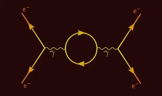
Since reading the ‘Surely You’re Joking’ books at university, the physicist Richard Feynman has been one of my heroes.
One of the things he is famous for is developing the Feynman diagram that simplified sub atomic particle interactions.
Apparently, if you flick through old copies of Physics Review you suddenly find editions with one or two of these diagrams in them.
Then, more and more appear until whole editions are published with nothing else in them, as the diagram briefly revolutionised physics – almost the way that a new species might appear and evolve.
For a while I read all the popular physics books I could. But there are only so many times you can read about the big bang, so I moved onto other popular science books like ‘The Tipping Point’, ‘SuperFreakonomics’, ‘Nudge’ and all the usual ones that I’m sure you have read, too.
I particularly liked ‘Six Degrees: the science of a connected age’ and ‘Connected: the surprising power of our social networks and how they shape our lives.’
Strangely, it then turned out that one of my patients knew Feynman and attended several parties at which he was present while he lived in America.
Broadcasters and odd balls
Some months ago, I saw a ‘try this link’ which made a map of your LinkedIn connections, showing the links between them.
It was very pretty, but it failed to give me any real insights – some people are more connected than others; but I knew that.
One of the books that I read on networks, however, suggested that there are different types of people in a network.
Some are broadcasters: they have big networks of contacts and aren’t afraid to use them to broadcast a message – whether this is about a must-watch film, must-read book, must-visit restaurant or health advice.
Even better, some of these people are listened to. Advertisers are trying to work out how to tap into these people as are they are the trend setters.
Others may have lots of links but aren’t believed. Some may not have many links and therefore fall into the category of followers or odd balls.
Recruiting the broadcasters
My clinical commissioning group has just gone through its authorisation day. As a result, it’s now down to seven ‘reds’; five of which are technical, and the remaining two shouldn’t be a problem.
With things going along pretty well, the CCG has just appointed a communication and engagement person, who seems great.
As IT lead, I’ve been thinking about how we can support her and whether these virtual communities are the way forward and how we can exploit them.
Our website project is going well, and is using a syndication idea – news and blog items put on the head CCG website appear on all connected practice sites, increasing the distribution. But what I want now is more user feedback and interaction and fewer push messages.
How do we get the aforementioned trusted broadcasters to give out health messages about things like screening programmes and appropriate usage of health services; perhaps even about meaty topics like rationing and affordability? I’m not sure Facebook is going to help here?
Mapping the future
As part of the authorisation process, we had to demonstrate we knew our patients; and I’ve been thinking about how we could use creative graphics – link the LinkedIn network map – to take this to the next level.
Luckily, I’ve been having some very interesting conversations with Andrew Frith- the interim director of business intelligence at our local commissioning support unit – who seems to be one step ahead of me; at least in terms of what tools there are to do this.
I was already familiar with sites like ‘Information is Beautiful’ but he has given me a huge list of similar sites and tools and seems to get what I’m talking about.
Some of this work appears to have been done from a public health point of view. And when I raised this topic on LinkedIn, some commentators told me they had seen some visualisation of what sounded like process maps of services.
But I wonder if it has ever been done on a practice population level? Let’s imagine each patient as a dot. The size of the dot represents the number of contacts that they have with a surgery.
Now let’s imagine the dot becoming a circle, divided into pies according to the doctor they saw there – red for Dr Paul, Blue for Dr Baker, and so on. This might start to show who is seeing whom.
If we had ten points on the paper for our consulters, and moved the dots closer to who they saw most, that might help show differences.
I can visualise a second layer of nurse or other allied health care interactions. It might be interesting to see if any sets of patients see multiple health care providers more than others, and whether this is linked to one or more doctors.
We might need to add in age, demographics and disease burden somehow. I guess it might all get very complicated without careful planning.
Finding effective consulters
What is the point, you might ask? Well this goes back to something I’ve touched on before. I was recently chatting to a GP from a practice down south, who had done a lot of work on effective consulters.
The work had started because the GP’s practice reckoned that their highly paid chronic disease management nurses weren’t good value for money.
It thought they were taking too long per patient for the results generated, with too many repeat visits and little improvement in measurable outcomes.
They also felt that different doctors had very different working patterns, and were looking at which salaried doctors they should offer a partnership to.
Instead of basing this on niceness per se – although team fit will always be a factor – they were looking at how many patients different doctors saw and managed on their case load. This included how many needless follow ups they generated and how much they protected themselves.
It’s always been a medical in-joke that just-about-to-retire senior partners stop doing medicine and just take lots of blood pressures; and that some doctors ask every patient they see to come just to check that they are ok. Both traits may gain extra marks on a satisfaction survey, but is it good business?
I can see another visualisation, this time by consulter, showing new to follow up ratios, referral rates to other services and investigation usage – all indicated by the thickness of arrows. I can see one comparing and contrasting prescribing or referrals.
Somehow we would need to put outcomes and health spend on the plan, but perhaps this is what should be presented at an appraisal – not how many patients think you are wonderful because you have given in to their crazy demands.
About the author: Dr Neil Paul is a full time partner at Sandbach GPs, a large (21,000 patient) practice in a semi rural Cheshire. He is one of five executive GPs for NHS South Cheshire CCG and has a mixed portfolio that includes IT.
He was previously on the PEC of NHS Central and East Cheshire. He also writes iPhone software, runs a primary care clinical trials unit and is involved in several exciting IT projects.