The industry CCIO: let’s get serious about usability
- 23 May 2016

At the heart of Bob Wachter’s book ‘The Digital Doctor’ is the message that usability is a key enabler for the clinical adoption of electronic records.
Usability encompasses many facets, including the workflow the clinical system imposes on the user, what and how data is displayed, and how the system itself impacts that unique interaction between the clinician and the patient.
We live in a time where usability is king; Apple and Alphabet (Google) have been so successful because they have a laser-like focus on the customer experience. Very few of us need a training course to use our iPhone for previously complex tasks such as flight booking or managing our bank accounts.
Yet some clinical systems are so complex that highly qualified clinicians need up to a week of training before they can do the most basic of tasks.
I’m sure we have all held our heads in our hands as we have seen busy nurses and doctors admitting patients to a ward and wasting time logging into multiple systems, searching for the same patient in different systems, entering different data into these fragmented systems; and still duplicating all that on paper. Is this the type of usability that we should expect?
Form v function
As healthcare IT has grown over the past 20 years, there has been a focus by all involved on functionality.
Suppliers have differentiated by the depth of their functionality, customers have procured systems primarily based on what they do (rather than how they do it), NHS strategy has advanced new services which have added to the functionality, and users’ requests have predominantly been for ‘wanting it to do xxxx’.
I read many of the NHS procurement documents; and there is scant reference to usability and certainly no reference to objective measures of usability.
This is why the CCIO Network’s SUS / cSUS survey is so important – it starts the debate around how all of us (suppliers, procurers, and users) consider, analyse and promote usability in clinical systems. As part of helping to build a culture where usability can be discussed openly, I’d like to share some of the ways we at Emis Health look at this area.
Co-design
A collaborative ethos is fundamental to the way that Emis Health designs and develops its software. We work closely with users (including those procuring systems) to define their needs, to understand how they approach the particular elements of any task, what they need to see and when, the workflow that they are undertaking, and – most importantly – the outcome they are looking to achieve.
Indeed, in a procurement process, if our experts feel the usability of a system may be compromised by certain functional requirements we will engage collaboratively and look to understand and modify the requirements to achieve the same outcome.
We have a dedicated usability team that is not comprised of developers but of qualified user experience designers who have a close link to our clinical teams. They work closely with users and in-house clinicians to rapidly prototype and iterate workflows and screen designs from which the development team builds the product.
Throughout the agile product development process, users are given access to the evolving new functionality to make sure it meets their needs and workflows. This co-design process continues after release as we get feedback directly or through our user groups.
Holistic user experience
Consistency is a vital component of usability and this is exemplified by Apple and Google. Like them, we guard against the temptation to make seemingly small changes – like the colour or layout of a screen – just because we can.
We have learned that these types of changes can compromise the whole ethos and holistic design of a system, upsetting the user dynamic and disenfranchising the user. While it can be frustrating to leave a clunky part of a system untouched, it is sometimes the right thing to do.
Stop telling me what to do!
One of our biggest challenges is alerting. There is a constant feedback theme from our users around “Stop telling me what to do” and “These alerts get in the way.” However, there is an equal pressure from users and managers saying “Make sure you do x” and – when things go wrong – “Why didn’t the system stop me?”
We work tirelessly trying to make the alerting more intelligent and relevant and to avoid ‘over alerting’ and consequent ‘alert fatigue’.
Recently we introduced a sepsis alert co-designed with UK Sepsis Trust and expert primary care users. Some have found it annoying and or intrusive, while others have welcomed it wholeheartedly and have questioned the medicolegal position of the users who disable it!
A near miss: and our response
To try and bring our approach to life, here’s a recent example. This touches on a critical area of the Emis Web system – drug warnings for prescribers.
Computer systems clearly have a vital role to play in helping clinicians to avoid prescribing mistakes – whether that be prescribing something that is contraindicated for an individual patient or inadvertently picking the wrong dose or formulation of a medicine.
Emis Web addresses this in a number of ways, including: decision support protocols, pop-up warnings, inline alerts and picking list indicators presented to the user in different colours, icons and formats – all following NHS Common User Interface or CUI guidance and industry standard design approaches.
We were prompted to look again at this aspect of the system when a pharmacist contacted us to highlight a potential prescribing error: a short acting neuroleptic had been selected instead of a longer acting one.
The system was working correctly. Yet the user had picked the short acting neuroleptic in error and ignored the what we thought were clear warnings that stopped them proceeding with the prescription. Fortunately, the pharmacist had prevented any harm occurring.
We were uncomfortable that while there was no ‘bug’ in the system, an experienced user had been able to produce a prescription which could have harmed the patient.
A near miss potential significant event had occurred and so we decided to conduct some research to help us understand how users interact with drug warnings. We set out to analyse how many alerts are generated and in what conditions, and how many are ignored by end users.
We also wanted to use eye-tracking software to review user interaction with prescribing screens – measuring actual and self-reported behaviour. This was done at the last Emis National User Group conference.
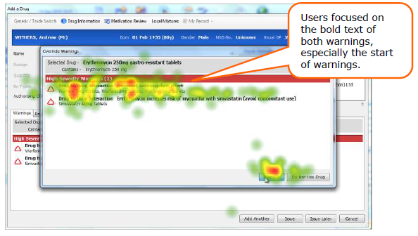
The results were fascinating. We found that:
Picking lists
- Ordering is vital – most users will only look at the first few items in a picking list and not scan down. The specific error came about because the short active form of the neuroleptic was above the long acting form
- The only exception is when red text is used to signify more dangerous medication (such as Methotrexate): then, the eye is drawn to those medications not the safer ones
- The ‘inline’ decision support is frequently ignored.
Alerts
- High severity alerts do interrupt workflow and ensure the user has to ‘act’ to proceed
- Over alerting is a significant issue – we found examples of spurious high severity alerts which have created ‘alert fatigue’ (for example duplicate scripts for Warfarin)
- Most users were drawn to read the bold text on high alerts
- When presented with two warnings, some users missed the second – missing a critical interaction
- Users read the beginning of the text, few get to the end; and multiple alerts often get missed.
We are now in the process of overhauling the user’s experience of this part of the system. Working closely with users, our UX team is developing new prototypes to improve picking lists, alert clarity, display and readability.
We will test these in live scenarios using eye tracking software to quantify the improvement and then deploy the new screens to all users.
In the meantime, we have already reduced high severity drug warnings by 25% to tackle the issue of over-alerting and are working hard on the display of alerts to ensure that they are concise and trigger the appropriate reaction in the user.
Some final thoughts
Usability is a vital issue for healthcare IT and one that will only become more important in the future. With the other major system suppliers, I await with interest the result of the first Clinical Software Usability Survey this summer (and I hope that Emis Health delivers a strong performance against this vital yardstick).
I also look forward to being part of a broader movement to ensure that usability is a key consideration for healthcare IT design and procurement.
|
Shaun O' Hanlon
|
|||||||